
Grid Column Block
Hello, and welcome once more, in this page you will learn about, Grid Column Block, which represent a piece of layout inside a canvas of Grid system that represent its Width as 12 columns sizes, and the Column Block allows you to create Responsive Columns that change its size based on the Device or Screen size.
Layouts Options
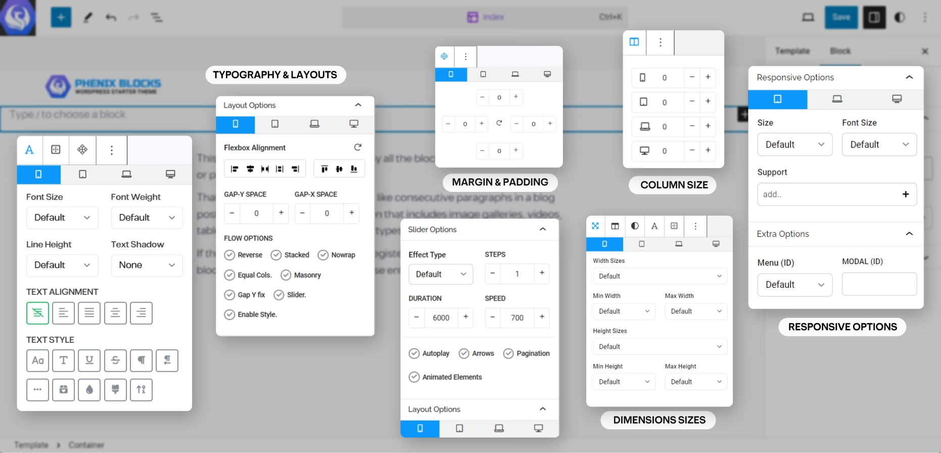
on Every block that has been designed to wrap up children elements and layout, like Container, Group, Row, Column, etc. which allow you to create any layout and make it responsive across all devices and screen size, you have all CSS Flexbox options,
and Phenix Grid System with the Support to Convert this layout into a Sliders and Carousels, you can control each column size in each screen, you can create equal columns layouts, or go more complex with the Masonry, and Gallery layout design patterns.
Flexbox layout options
Grid Row Options
Columns Sizes 01 – 12 Max Size No.13 Will take all Available Space
Slider/Carousel Options
Slider Options
you can turn the Row block to a slider of any kind, Powered by swiper slider and all its features at your editor.
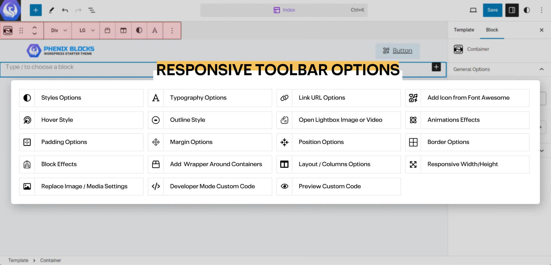
Toolbar Options
in every Block you have, you will find often the main options of the block in the Quick access Toolbar that shows above the selected block, and here is a list of the Options you may came across:
the block editor is very straight forward you have 3 areas to focus on the Content big area where your content is, and Top Bar, which you will find the quick controls and options of any part of the content you’re selecting at the moment.
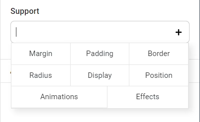
CSS Properties
in the sidebar of the Block Editor, when you focus on one of Phenix Blocks you will often find a Field called Support, and from this Field you can Activate a lot of styling options to customize your content Freely and here is an Example of some of these options.