Typography Styles
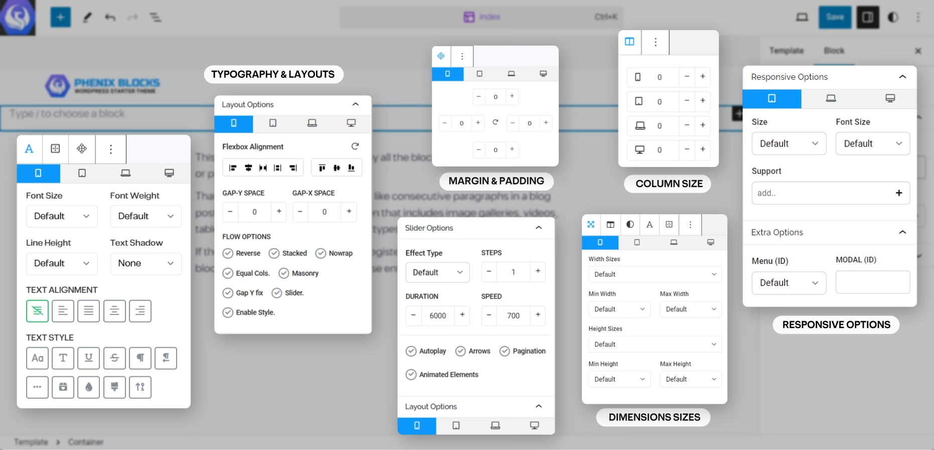
on Every block that has children content you can find a Typography button in the Toolbar of the block, and here is where you can customize everything related to the text of that block.
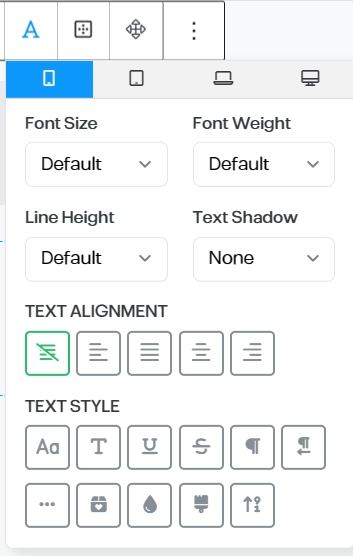
you can change the Font Size, Weight and Line Height add a Text Shadow or align the text as needed, with extra options for typography styling and formatting.
and all of the options are responsive, across all the screen sizes.
Typography Options
- Font Family
- Font Size
- Font Weight
- Line-Height
- Preset Shadows
- Text Alignment
- Text Styles
- Uppercase
- Capitalize
- Underline
- Strikethrough
- LTR/RTL
- No-Wrap Text
- Colored Last World
- Gradient Text Colors
- Clip Background into the Text
- Animated Count Up Numbers
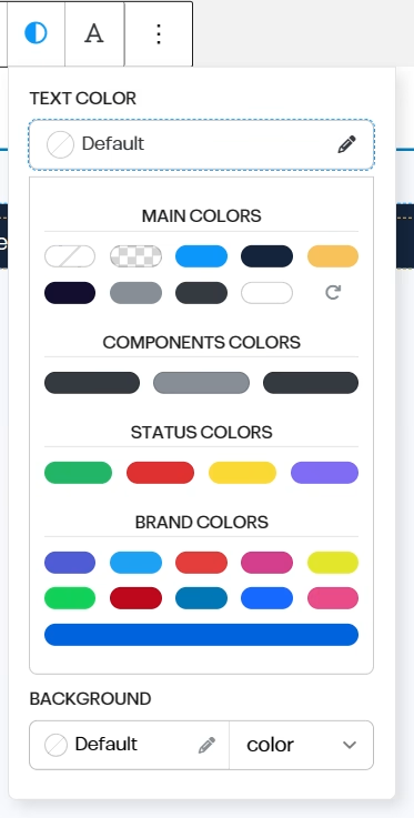
Text Colors
all the available colors are Pre-Registered by the Theme you have, and based on Phenix Design System (the Front-End Framework), it has a set of colors for both background and text that you can use without getting out of your Brand, and makes it easier for Content Creators to align their content with the theme and the brand colors.
and you can add more colors by adding custom colors from your editor styles.
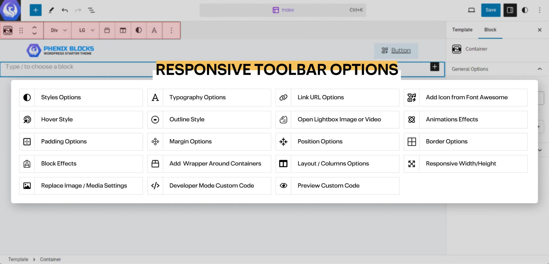
Toolbar Options
in every Block you have, you will find often the main options of the block in the Quick access Toolbar that shows above the selected block, and here is a list of the Options you may came across:
the block editor is very straight forward you have 3 areas to focus on the Content big area where your content is, and Top Bar, which you will find the quick controls and options of any part of the content you’re selecting at the moment.